3. Gráficos básicos: matplotlib & seaborn#
import matplotlib as mpl
mpl.get_backend()
'module://matplotlib_inline.backend_inline'
import matplotlib.pyplot as plt
plt.rcParams.update({'figure.max_open_warning': 0})
#plt.plot?
Dado que el estilo predeterminado es la línea ‘-’, no se mostrará nada si solo pasamos en un punto \((3,2)\)
plt.plot(3, 2)
[<matplotlib.lines.Line2D at 0x10f0e2540>]
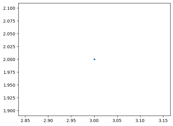
Podemos pasarle ‘.’ a plt.plot para indicar que queremos el punto \((3,2)\) tal que sea puesto como un marker
plt.plot(3, 2, '.')
[<matplotlib.lines.Line2D at 0x10f1ae780>]
Veamos como hacer un plot usando la capa scripting.
# Primero configuremos el backend sin usar mpl.use() de la capa de scripting
from matplotlib.backends.backend_agg import FigureCanvasAgg
from matplotlib.figure import Figure

# crear una nueva figura
fig = Figure()

# asociamos "fig" con el backend
canvas = FigureCanvasAgg(fig)

# se agrega un subplot a la figura
ax = fig.add_subplot(111)

# graficamos el punto (3,2)
ax.plot(3, 2, '.')

# guardamos la figura en test.png
#canvas.print_png('test.png')
[<matplotlib.lines.Line2D at 0x10f30bd40>]
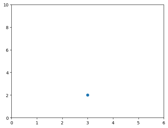
# creamos una nueva figura
plt.figure()

# graficamos el punto (3,2) usando el marker de circulo
plt.plot(3, 2, 'o')

# obtenemos el eje actual
ax = plt.gca()

# Fijamos las propiedades del eje [xmin, xmax, ymin, ymax]
ax.axis([0,6,0,10])
(0.0, 6.0, 0.0, 10.0)
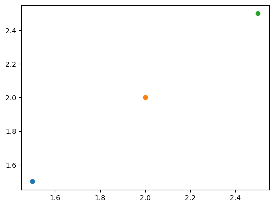
# creamos una nueva figura
plt.figure()

# graficamos el punto (1.5, 1.5) usando un marker de circulo
plt.plot(1.5, 1.5, 'o')
# graficamos el punto (2, 2) usando un marker de circulo
plt.plot(2, 2, 'o')
# graficamos el punto (2.5, 2.5) usando un marker de circulo
plt.plot(2.5, 2.5, 'o')
[<matplotlib.lines.Line2D at 0x10f3dcf20>]
# Accedemos al eje actual
ax = plt.gca()
# obtenemos todos los objetos hijo que contiene el eje
ax.get_children()
[<matplotlib.spines.Spine at 0x10f402810>,
 <matplotlib.spines.Spine at 0x10f4027e0>,
 <matplotlib.spines.Spine at 0x10f402150>,
 <matplotlib.spines.Spine at 0x10f4010a0>,
 <matplotlib.axis.XAxis at 0x10f1175f0>,
 <matplotlib.axis.YAxis at 0x10f13a990>,
 Text(0.5, 1.0, ''),
 Text(0.0, 1.0, ''),
 Text(1.0, 1.0, ''),
 <matplotlib.patches.Rectangle at 0x10f415fa0>]

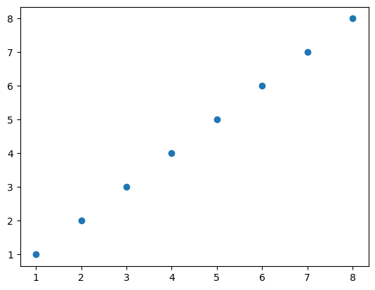
3.1. Scatterplots#
import numpy as np

x = np.array([1,2,3,4,5,6,7,8])
y = x

plt.figure()
plt.scatter(x, y) # similar a plt.plot(x, y, '.'), pero los objetos hijos en "axes" no son Line2D
<matplotlib.collections.PathCollection at 0x10f4030b0>
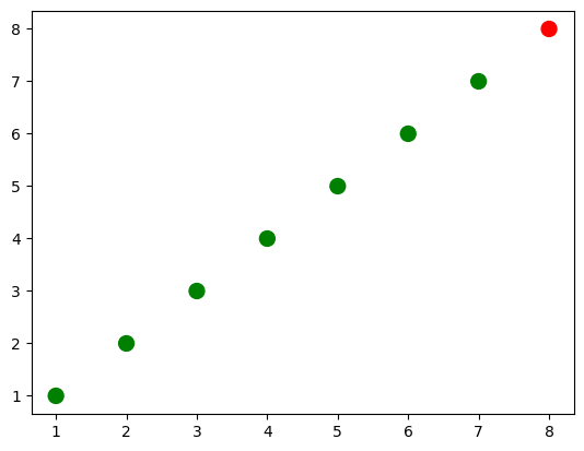
import numpy as np

x = np.array([1,2,3,4,5,6,7,8])
y = x

# creamos una lista de colores para cada punto que tenemos
# ['green', 'green', 'green', 'green', 'green', 'green', 'green', 'red']
colors = ['green']*(len(x)-1)
colors.append('red')

plt.figure()

# graficamos el punto con tamaño 100 y los colores elegidos
plt.scatter(x, y, s=100, c=colors)
<matplotlib.collections.PathCollection at 0x10f117ad0>
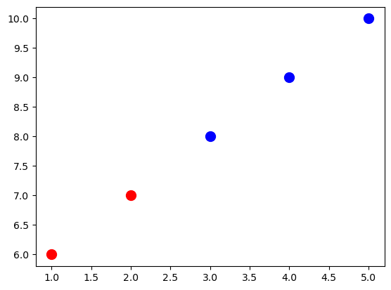
# convertimos las dos listas en una lista de tuplas en parejas
zip_generator = zip([1,2,3,4,5], [6,7,8,9,10])

print(list(zip_generator))
# lo de arriba imprime:
# [(1, 6), (2, 7), (3, 8), (4, 9), (5, 10)]

zip_generator = zip([1,2,3,4,5], [6,7,8,9,10])
# La estrella * "desempaca" una colección en argumentos posicionales
print(*zip_generator)
# lo de arriba imprime:
# (1, 6) (2, 7) (3, 8) (4, 9) (5, 10)
[(1, 6), (2, 7), (3, 8), (4, 9), (5, 10)]
(1, 6) (2, 7) (3, 8) (4, 9) (5, 10)
# use zip para convertir 5 tuplas con 2 elementos cada una en 2 tuplas con 5 elementos cada una
print(list(zip((1, 6), (2, 7), (3, 8), (4, 9), (5, 10))))
# lo de arriba imprime:
# [(1, 2, 3, 4, 5), (6, 7, 8, 9, 10)]


zip_generator = zip([1,2,3,4,5], [6,7,8,9,10])
# volvamos los datos a 2 listas
x, y = zip(*zip_generator) # Lo siguiente es equivalente zip((1, 6), (2, 7), (3, 8), (4, 9), (5, 10))
print(x)
print(y)
# lo de arriba imprime:
# (1, 2, 3, 4, 5)
# (6, 7, 8, 9, 10)
[(1, 2, 3, 4, 5), (6, 7, 8, 9, 10)]
(1, 2, 3, 4, 5)
(6, 7, 8, 9, 10)
plt.figure()
# graficar una serie de datos 'Estudiantes altos' en rojo usando los dos primeros elementos de x e y
plt.scatter(x[:2], y[:2], s=100, c='red', label='Estudiantes altos')
# graficamos una segunda serie de datos 'Estudiantes bajos' en azul usando los últimos tres elementos de x e y
plt.scatter(x[2:], y[2:], s=100, c='blue', label='Estudiantes bajos')
<matplotlib.collections.PathCollection at 0x10f58d8b0>
# agregamos una etiqueta en el eje x
plt.xlabel('Número de veces que el niño patea una pelota')
# agregamos una etiqueta en el eje y
plt.ylabel('La nota del estudiante')
# add a title
plt.title('Relación entre patear la pelota y notas')
Text(0.5, 1.0, 'Relación entre patear la pelota y notas')
# agregar una leyenda (usa las etiquetas de plt.scatter)
plt.legend()
/var/folders/3s/mwy450px7bz09c4zp_hpgl480000gn/T/ipykernel_6875/2467656890.py:2: UserWarning: No artists with labels found to put in legend.  Note that artists whose label start with an underscore are ignored when legend() is called with no argument.
  plt.legend()
<matplotlib.legend.Legend at 0x10ec51ac0>
# agregue la leyenda a loc = 4 (la esquina inferior derecha), también elimina el marco y agrega un título
plt.legend(loc=4, frameon=False, title='Legenda')
/var/folders/3s/mwy450px7bz09c4zp_hpgl480000gn/T/ipykernel_6875/4087772879.py:2: UserWarning: No artists with labels found to put in legend.  Note that artists whose label start with an underscore are ignored when legend() is called with no argument.
  plt.legend(loc=4, frameon=False, title='Legenda')
<matplotlib.legend.Legend at 0x10f36e4b0>
# obtener hijos de los ejes actuales (la leyenda es el penúltimo elemento de esta lista)
plt.gca().get_children()
[<matplotlib.spines.Spine at 0x10f6f8860>,
 <matplotlib.spines.Spine at 0x10f6fa840>,
 <matplotlib.spines.Spine at 0x10f6fb0e0>,
 <matplotlib.spines.Spine at 0x10f6f99d0>,
 <matplotlib.axis.XAxis at 0x10f6fab70>,
 <matplotlib.axis.YAxis at 0x10f6fb3b0>,
 Text(0.5, 1.0, ''),
 Text(0.0, 1.0, ''),
 Text(1.0, 1.0, ''),
 <matplotlib.patches.Rectangle at 0x10f719310>]
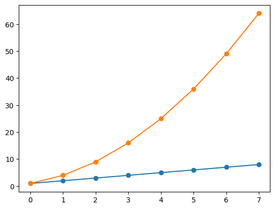
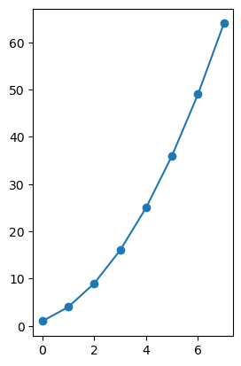
3.2. Gráficos de linea#
import numpy as np
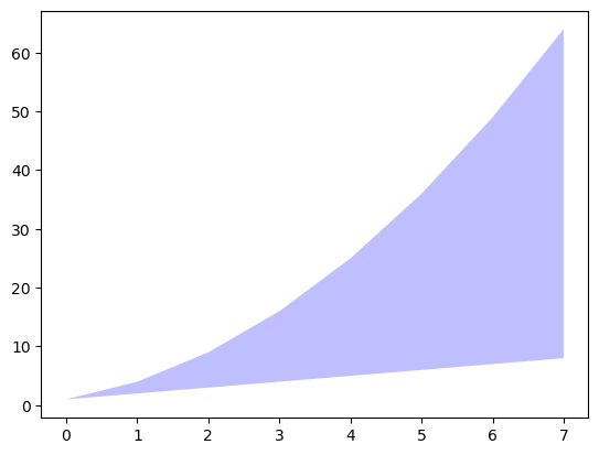
linear_data = np.array([1,2,3,4,5,6,7,8])
exponential_data = linear_data**2
plt.figure()
# graficar los datos lineales y los datos exponenciales
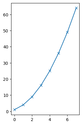
plt.plot(linear_data, '-o', exponential_data, '-o')
[<matplotlib.lines.Line2D at 0x10f781520>,
 <matplotlib.lines.Line2D at 0x10f781400>]
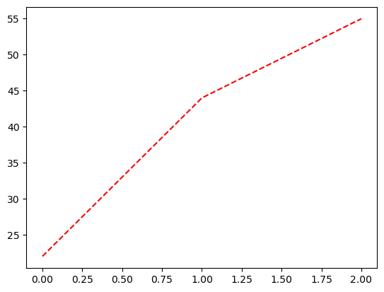
# graficar otra serie con una línea roja discontinua
plt.plot([22,44,55], '--r')
[<matplotlib.lines.Line2D at 0x10f7eb380>]
plt.xlabel('Algún conjunto de datos')
plt.ylabel('Otro conjunto de datos')
plt.title('Un título')
# agregue una leyenda con entradas de leyenda (porque no teníamos etiquetas cuando graficamos la serie de datos)
plt.legend(['Línea base', 'Compentencia', 'Nosotros'])
<matplotlib.legend.Legend at 0x10f6db680>
# llenar el área entre los datos lineales y los datos exponenciales
plt.gca().fill_between(range(len(linear_data)),
                       linear_data, exponential_data,
                       facecolor='blue',
                       alpha=0.25)
<matplotlib.collections.PolyCollection at 0x10f335250>
¡Intentemos trabajar con fechas!
plt.figure()

observation_dates = np.arange('2017-01-01', '2017-01-09', dtype='datetime64[D]')

plt.plot(observation_dates, linear_data, '-o',  observation_dates, exponential_data, '-o')
[<matplotlib.lines.Line2D at 0x10f4d9040>,
 <matplotlib.lines.Line2D at 0x11a1456a0>]
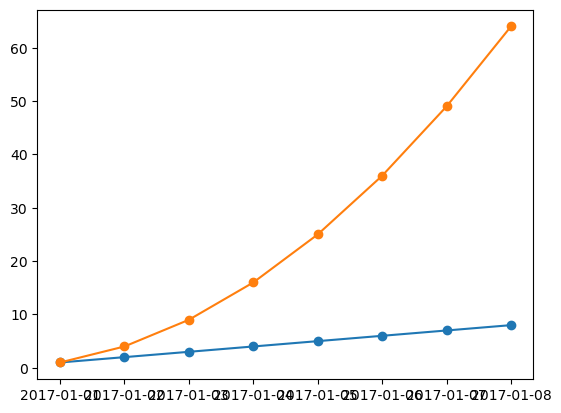
Intentemos usar pandas
import pandas as pd
plt.figure()
observation_dates = np.arange('2017-01-01', '2017-01-09', dtype='datetime64[D]')
observation_dates = list(map(pd.to_datetime, observation_dates)) #convertir el map en una lista
plt.plot(observation_dates, linear_data, '-o',  observation_dates, exponential_data, '-o')
[<matplotlib.lines.Line2D at 0x12af73080>,
 <matplotlib.lines.Line2D at 0x12b8fa270>]
x = plt.gca().xaxis

# rotar las etiquetas del eje x
for item in x.get_ticklabels():
    item.set_rotation(45)
# ajustar el subplot para que el texto no se salga de la imagen
plt.subplots_adjust(bottom=0.25)
<Figure size 640x480 with 0 Axes>
ax = plt.gca()
ax.set_xlabel('Fecha')
ax.set_ylabel('Unidades')
ax.set_title('Rendimiento Exponencial vs. Lineal')
Text(0.5, 1.0, 'Rendimiento Exponencial vs. Lineal')
# you can add mathematical expressions in any text element
ax.set_title("Rendimiento Exponential ($x^2$) vs. Linear ($x$)")
Text(0.5, 1.0, 'Rendimiento Exponential ($x^2$) vs. Linear ($x$)')
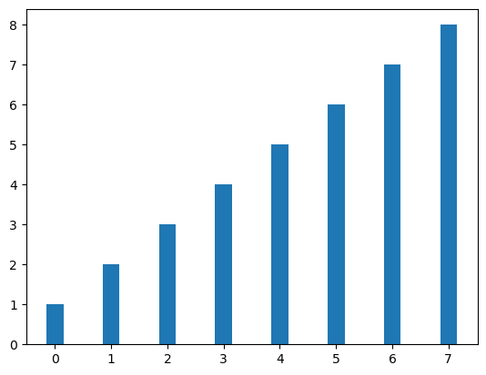
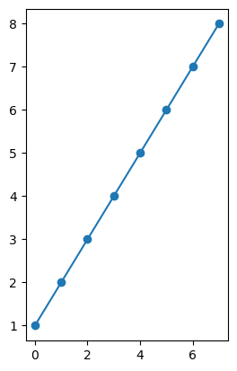
3.3. Gráficos de barras#
plt.figure()
xvals = range(len(linear_data))
plt.bar(xvals, linear_data, width = 0.3)
<BarContainer object of 8 artists>
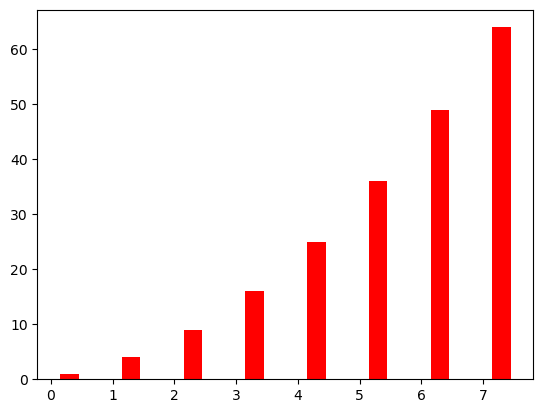
new_xvals = []

# graficar otro conjunto de barras, ajustando los nuevos "xvals" para compensar el primer conjunto de barras graficados
for item in xvals:
    new_xvals.append(item+0.3)

plt.bar(new_xvals, exponential_data, width = 0.3 ,color='red')
<BarContainer object of 8 artists>
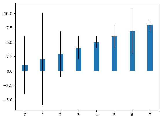
from random import randint
linear_err = [randint(0,15) for x in range(len(linear_data))]

# Esto graficará un nuevo conjunto de barras con barras de error utilizando la lista de valores de error aleatorios.
plt.bar(xvals, linear_data, width = 0.3, yerr=linear_err)
<BarContainer object of 8 artists>
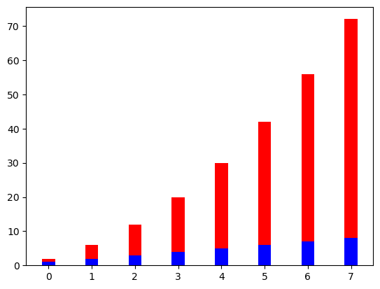
# También son posibles gráficos de barras apiladas
plt.figure()
xvals = range(len(linear_data))
plt.bar(xvals, linear_data, width = 0.3, color='b')
plt.bar(xvals, exponential_data, width = 0.3, bottom=linear_data, color='r')
<BarContainer object of 8 artists>
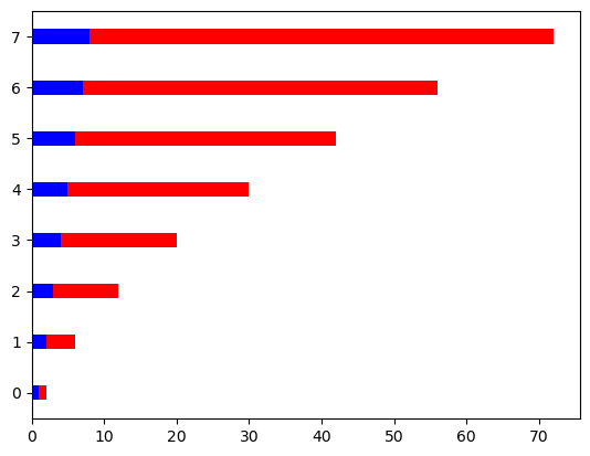
# o usar "barh" para gráficos de barras horizontales
plt.figure()
xvals = range(len(linear_data))
plt.barh(xvals, linear_data, height = 0.3, color='b')
plt.barh(xvals, exponential_data, height = 0.3, left=linear_data, color='r')
<BarContainer object of 8 artists>
3.4. Subplots#
import matplotlib.pyplot as plt
import numpy as np

#plt.subplot?
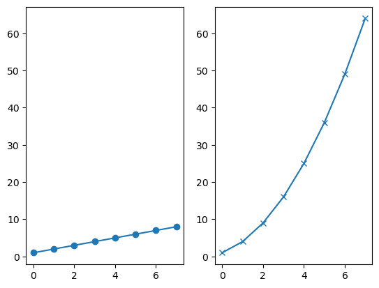
plt.figure()
# el subplot con 1 fila, 2 columnas y el eje actual es el primer eje del subplot
plt.subplot(1, 2, 1)

linear_data = np.array([1,2,3,4,5,6,7,8])

plt.plot(linear_data, '-o')
[<matplotlib.lines.Line2D at 0x12bcf1040>]
exponential_data = linear_data**2

# el subplot con 1 fila, 2 columnas, y el eje actual es el segundo eje del subplot
plt.subplot(1, 2, 2)
plt.plot(exponential_data, '-o')
[<matplotlib.lines.Line2D at 0x12bcc1940>]
# graficar datos exponenciales en el primer eje
plt.subplot(1, 2, 1)
plt.plot(exponential_data, '-x')
[<matplotlib.lines.Line2D at 0x12bd8bd40>]
plt.figure()
ax1 = plt.subplot(1, 2, 1)
plt.plot(linear_data, '-o')
# pasamos sharey = ax1 para asegurarse de que los dos subplots compartan el mismo eje y
ax2 = plt.subplot(1, 2, 2, sharey=ax1)
plt.plot(exponential_data, '-x')
[<matplotlib.lines.Line2D at 0x12e827ec0>]
plt.figure()
# el lado derecho es una sintaxis abreviada equivalente
plt.subplot(1,2,1) == plt.subplot(121)
True
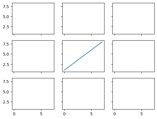
# creamos un grid 3x3 de subplots
fig, ((ax1,ax2,ax3), (ax4,ax5,ax6), (ax7,ax8,ax9)) = plt.subplots(3, 3, sharex=True, sharey=True)
# graficamos linear_data en el quinto eje del subplot
ax5.plot(linear_data, '-')
[<matplotlib.lines.Line2D at 0x12eab4740>]
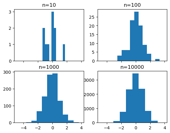
3.5. Histogramas#
# creamos un grid 2x2 de subplots
fig, ((ax1, ax2), (ax3, ax4)) = plt.subplots(2, 2, sharex=True)
axs = [ax1,ax2,ax3,ax4]
import random
random.seed(30)
# obtenemos muestras de n = 10, 100, 1000, y 10000 de uns distribución normal y graficamos los histogramas
for n in range(0,len(axs)):
    sample_size = 10**(n+1)
    sample = np.random.normal(loc=0.0, scale=1.0, size=sample_size)
    axs[n].hist(sample)
    axs[n].set_title('n={}'.format(sample_size))
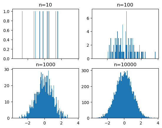
# repetimos con el numero de bins en 100
fig, ((ax1, ax2), (ax3, ax4)) = plt.subplots(2, 2, sharex=True)
axs = [ax1,ax2,ax3,ax4]

for n in range(0,len(axs)):
    sample_size = 10**(n+1)
    sample = np.random.normal(loc=0.0, scale=1.0, size=sample_size)
    axs[n].hist(sample, bins=100)
    axs[n].set_title('n={}'.format(sample_size))
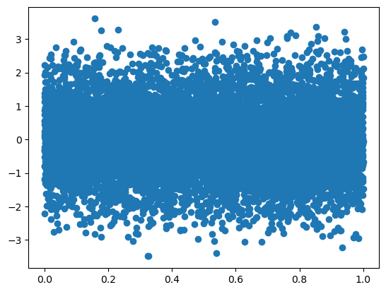
plt.figure()
Y = np.random.normal(loc=0.0, scale=1.0, size=10000)
X = np.random.random(size=10000)
plt.scatter(X,Y)
<matplotlib.collections.PathCollection at 0x12ef37080>
# usamos gridspec para dividir la figura en subplots
import matplotlib.gridspec as gridspec

plt.figure()
gspec = gridspec.GridSpec(3, 3)

top_histogram = plt.subplot(gspec[0, 1:])
side_histogram = plt.subplot(gspec[1:, 0])
lower_right = plt.subplot(gspec[1:, 1:])
Y = np.random.normal(loc=0.0, scale=1.0, size=10000)
X = np.random.random(size=10000)
lower_right.scatter(X, Y)
top_histogram.hist(X, bins=100)
s = side_histogram.hist(Y, bins=100, orientation='horizontal')
# limpieamos los histogramas  y graficamos los plots normados
top_histogram.clear()
top_histogram.hist(X, bins=100, density=True)
side_histogram.clear()
side_histogram.hist(Y, bins=100, orientation='horizontal', density=True)
# flip the side histogram's x axis
side_histogram.invert_xaxis()
3.6. Boxplots#
import pandas as pd
normal_sample = np.random.normal(loc=0.0, scale=1.0, size=10000)
random_sample = np.random.random(size=10000)
gamma_sample = np.random.gamma(2, size=10000)

df = pd.DataFrame({'normal': normal_sample,
                   'random': random_sample,
                   'gamma': gamma_sample})
df.describe()
| normal | random | gamma | |
|---|---|---|---|
| count | 10000.000000 | 10000.000000 | 10000.000000 |
| mean | 0.013979 | 0.500678 | 1.981256 |
| std | 1.002388 | 0.286461 | 1.390314 |
| min | -4.020373 | 0.000115 | 0.021542 |
| 25% | -0.662500 | 0.253152 | 0.962587 |
| 50% | 0.021120 | 0.503477 | 1.669557 |
| 75% | 0.696197 | 0.745451 | 2.690627 |
| max | 3.555428 | 0.999976 | 12.016624 |
plt.figure()
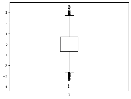
# crear un diagrama de caja de los datos normales, note el ";" al final
plt.boxplot(df['normal']);
# limpiamos la figura
plt.clf()
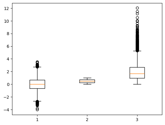
# graficamos diagramas de caja para las tres columnas de df
plt.boxplot([ df['normal'], df['random'], df['gamma'] ]);
plt.figure()
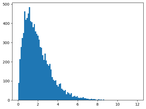
plt.hist(df['gamma'], bins=100);
import mpl_toolkits.axes_grid1.inset_locator as mpl_il

plt.figure()
plt.boxplot([ df['normal'], df['random'], df['gamma'] ])
# superponer el eje encima de otro
ax2 = mpl_il.inset_axes(plt.gca(), width='60%', height='40%', loc=2)
ax2.hist(df['gamma'], bins=100)
ax2.margins(x=0.5)
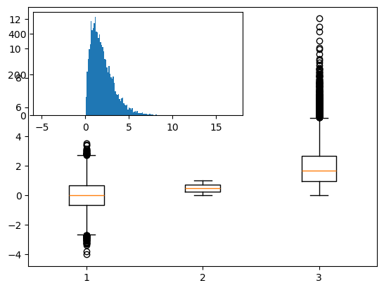
# cambiar las marcas del eje y para ax2 al lado derecho
ax2.yaxis.tick_right()
# si no se pasa el argumento `whis`, el boxplot tiene por default to mostrar 1.5*interquartile (IQR) con outliers
plt.figure()
plt.boxplot([ df['normal'], df['random'], df['gamma'] ] );
3.7. Heatmaps#
plt.figure()
Y = np.random.normal(loc=0.0, scale=1.0, size=10000)
X = np.random.random(size=10000)
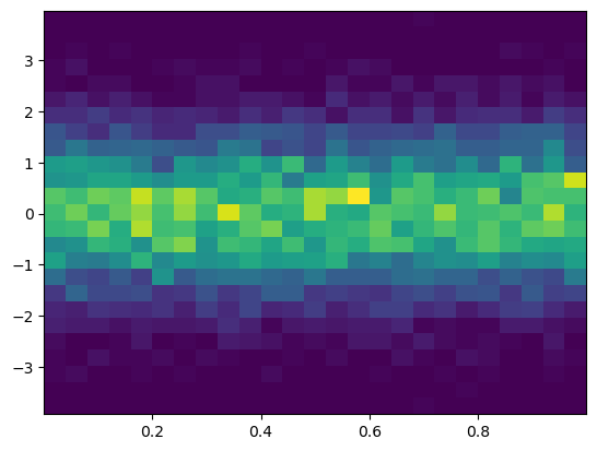
plt.hist2d(X, Y, bins=25);
plt.figure()
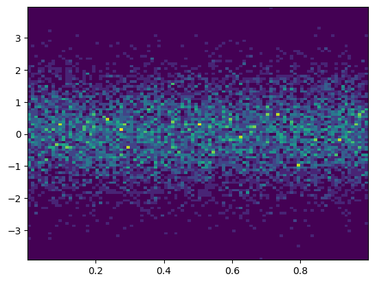
plt.hist2d(X, Y, bins=100);
# añadimos la leyenda de colores
#plt.colorbar()
3.8. Visualización con Pandas#
import pandas as pd
import numpy as np
import matplotlib.pyplot as plt
# consulte los estilos predefinidos proporcionados.
plt.style.available
['Solarize_Light2',
 '_classic_test_patch',
 '_mpl-gallery',
 '_mpl-gallery-nogrid',
 'bmh',
 'classic',
 'dark_background',
 'fast',
 'fivethirtyeight',
 'ggplot',
 'grayscale',
 'seaborn-v0_8',
 'seaborn-v0_8-bright',
 'seaborn-v0_8-colorblind',
 'seaborn-v0_8-dark',
 'seaborn-v0_8-dark-palette',
 'seaborn-v0_8-darkgrid',
 'seaborn-v0_8-deep',
 'seaborn-v0_8-muted',
 'seaborn-v0_8-notebook',
 'seaborn-v0_8-paper',
 'seaborn-v0_8-pastel',
 'seaborn-v0_8-poster',
 'seaborn-v0_8-talk',
 'seaborn-v0_8-ticks',
 'seaborn-v0_8-white',
 'seaborn-v0_8-whitegrid',
 'tableau-colorblind10']
# usamos el estilo 'seaborn-colorblind'
plt.style.use('seaborn-colorblind')
---------------------------------------------------------------------------
FileNotFoundError                         Traceback (most recent call last)
File /opt/anaconda3/lib/python3.12/site-packages/matplotlib/style/core.py:137, in use(style)
    136 try:
--> 137     style = _rc_params_in_file(style)
    138 except OSError as err:

File /opt/anaconda3/lib/python3.12/site-packages/matplotlib/__init__.py:870, in _rc_params_in_file(fname, transform, fail_on_error)
    869 rc_temp = {}
--> 870 with _open_file_or_url(fname) as fd:
    871     try:

File /opt/anaconda3/lib/python3.12/contextlib.py:137, in _GeneratorContextManager.__enter__(self)
    136 try:
--> 137     return next(self.gen)
    138 except StopIteration:

File /opt/anaconda3/lib/python3.12/site-packages/matplotlib/__init__.py:847, in _open_file_or_url(fname)
    846 fname = os.path.expanduser(fname)
--> 847 with open(fname, encoding='utf-8') as f:
    848     yield f

FileNotFoundError: [Errno 2] No such file or directory: 'seaborn-colorblind'

The above exception was the direct cause of the following exception:

OSError                                   Traceback (most recent call last)
Cell In[59], line 2
      1 # usamos el estilo 'seaborn-colorblind'
----> 2 plt.style.use('seaborn-colorblind')

File /opt/anaconda3/lib/python3.12/site-packages/matplotlib/style/core.py:139, in use(style)
    137         style = _rc_params_in_file(style)
    138     except OSError as err:
--> 139         raise OSError(
    140             f"{style!r} is not a valid package style, path of style "
    141             f"file, URL of style file, or library style name (library "
    142             f"styles are listed in `style.available`)") from err
    143 filtered = {}
    144 for k in style:  # don't trigger RcParams.__getitem__('backend')

OSError: 'seaborn-colorblind' is not a valid package style, path of style file, URL of style file, or library style name (library styles are listed in `style.available`)
3.8.1. DataFrame.plot#
np.random.seed(123)

df = pd.DataFrame({'A': np.random.randn(365).cumsum(0),
                   'B': np.random.randn(365).cumsum(0) + 20,
                   'C': np.random.randn(365).cumsum(0) - 20},
                  index=pd.date_range('1/1/2017', periods=365))
df.head()
| A | B | C | |
|---|---|---|---|
| 2017-01-01 | -1.085631 | 20.059291 | -20.230904 |
| 2017-01-02 | -0.088285 | 21.803332 | -16.659325 |
| 2017-01-03 | 0.194693 | 20.835588 | -17.055481 |
| 2017-01-04 | -1.311601 | 21.255156 | -17.093802 |
| 2017-01-05 | -1.890202 | 21.462083 | -19.518638 |
Podemos seleccionar qué gráfico queremos usar pasándolo al parámetro ‘kind’.
df.plot('A','B', kind = 'scatter');

También puede elegir el tipo de figura utilizando los métodos DataFrame.plot.kind en lugar de proporcionar el argumento kind.
kind :
'line': line plot (default)'bar': vertical bar plot'barh': horizontal bar plot'hist': histogram'box': boxplot'kde': Kernel Density Estimation plot'density': same as ‘kde’'area': area plot'pie': pie plot'scatter': scatter plot'hexbin': hexbin plot
# crear un diagrama de dispersión de las columnas 'A' y 'C', cambiando el color (c) y el tamaño (s) según la columna 'B'
df.plot.scatter('A', 'C', c='B', s=df['B'], colormap='viridis');

ax = df.plot.scatter('A', 'C', c='B', s=df['B'], colormap='viridis')
ax.set_aspect('equal')

df.plot.box();

df.plot.hist(alpha=0.7);

Los gráficos de estimación de densidad con kernel son útiles para derivar una función continua suave a partir de una muestra determinada.
df.plot.kde();

3.8.2. pandas.tools.plotting#
#import os as os
#os.chdir("C:/Users/VICTOR/Documents/AnalyticsPython/Data")
iris = pd.read_csv('Data/iris.csv')
iris.head()
| SepalLength | SepalWidth | PetalLength | PetalWidth | Name | |
|---|---|---|---|---|---|
| 0 | 5.1 | 3.5 | 1.4 | 0.2 | Iris-setosa |
| 1 | 4.9 | 3.0 | 1.4 | 0.2 | Iris-setosa |
| 2 | 4.7 | 3.2 | 1.3 | 0.2 | Iris-setosa |
| 3 | 4.6 | 3.1 | 1.5 | 0.2 | Iris-setosa |
| 4 | 5.0 | 3.6 | 1.4 | 0.2 | Iris-setosa |
pd.plotting.scatter_matrix(iris);

plt.figure()
#pd.tools.plotting.parallel_coordinates(iris, 'Name');
pd.plotting.parallel_coordinates(iris, 'Name');

3.9. Seaborn#
import numpy as np
import pandas as pd
import matplotlib.pyplot as plt
import seaborn as sns
np.random.seed(1234)

v1 = pd.Series(np.random.normal(0,10,1000), name='v1')
v2 = pd.Series(2*v1 + np.random.normal(60,15,1000), name='v2')
plt.figure()
plt.hist(v1, alpha=0.7, bins=np.arange(-50,150,5), label='v1');
plt.hist(v2, alpha=0.7, bins=np.arange(-50,150,5), label='v2');
plt.legend();

# graficar la estimación de la densidad del kernel sobre un gráfico de barras apilado
plt.figure()
plt.hist([v1, v2], histtype='barstacked', density=True);
v3 = np.concatenate((v1,v2))
sns.kdeplot(v3);
v3.shape

(2000,)
plt.figure()
# podemos pasar argumentos  para cada componente individual del gráfico
df_aux = pd.DataFrame({'V3':v3})
sns.displot(df_aux,kde = True,stat = 'density')


<seaborn.axisgrid.FacetGrid at 0x7fc721c59820>
sns.jointplot(x=v1,y=v2, alpha=0.4);

grid = sns.jointplot(x=v1,y=v2, alpha=0.4);
grid.ax_joint.set_aspect('equal')

sns.jointplot(x=v1,y=v2, kind='hex');

# establecer el estilo seaborn para todas las siguientes figuras
sns.set_style('white')

sns.jointplot(x=v1,y=v2, kind='kde', space=0);

iris = pd.read_csv('Data/iris.csv')
iris.head()
| SepalLength | SepalWidth | PetalLength | PetalWidth | Name | |
|---|---|---|---|---|---|
| 0 | 5.1 | 3.5 | 1.4 | 0.2 | Iris-setosa |
| 1 | 4.9 | 3.0 | 1.4 | 0.2 | Iris-setosa |
| 2 | 4.7 | 3.2 | 1.3 | 0.2 | Iris-setosa |
| 3 | 4.6 | 3.1 | 1.5 | 0.2 | Iris-setosa |
| 4 | 5.0 | 3.6 | 1.4 | 0.2 | Iris-setosa |
sns.pairplot(iris, hue='Name', diag_kind='kde', height=2);

plt.figure(figsize=(8,6))
plt.subplot(121)
kk = 4
sns.swarmplot(x='Name', y='PetalLength', data=iris,s = kk);
plt.subplot(122)
sns.violinplot(x='Name', y='PetalLength', data=iris,s = kk);

3.10. Tips#
3.10.1. Creando gráficos#
Figure
Operador |
Descripción |
|---|---|
fig = plt.figures() |
un contenedor que contiene todos los elementos del gráfico |
Axes
Operador |
Descripción |
|---|---|
fig.add_axes() |
Inicia un subplot |
a = fig.add_subplot(222) |
Un subplot es un AXES en un grid que tiene sistema fila-columna |
fig, b = plt.subplots(nrows=3, nclos=2) |
Agrega un subplot |
ax = plt.subplots(2, 2) |
Crea el subplot |
3.10.2. Graficando#
Datos 1D
Operador |
Descripción |
|---|---|
lines = plt.plot(x,y) |
Grafica datos conectados por líneas |
plt.scatter(x,y) |
Crea un gráfico de dispersión |
plt.bar(xvalue, data , width, color…) |
Gráfico de barras simple vertical |
plt.barh(yvalue, data, width, color…) |
Gráfico de barras simple horizontal |
plt.hist(x, y) |
Grafica un hisrograma |
plt.boxplot(x,y) |
Gráfico de caja y bigotes |
plt.violinplot(x, y) |
Gráfico de violín |
ax.fill(x, y, color=’lightblue’) |
Llena el área debajo de la curva |
ax.fill_between(x,y,color=’yellow’) |
Llena el área entre de la curva |
Datos 2D
Operador |
Descripción |
|---|---|
fig, ax = plt.subplots() |
|
im = ax.imshow(img, cmap, vmin…) |
Mapa de colores con arrays RGB |
Guardando gráficos
Operador |
Descripción |
|---|---|
plt.savefig(‘pic.png’) |
Se guarda el gráfico |
plt.savefig(‘transparentback.png’) |
Se guarda el gráfico con fondo transparente |
3.10.3. Personalización#
Color
Operador |
Descripción |
|---|---|
plt.plot(x, y, color=’lightblue’) |
|
plt.plot(x, y, alpha = 0.4) |
Se fija un color |
plt.colorbar(mappable, |
|
orientation=’horizontal’) |
mappable: la Image, Contourset etc a los que aplica la barra de colores |
Markers
Operador |
Descripción |
|---|---|
plt.plot(x, y, marker=’o’) |
Se agrega el tipo de punto |
plt.scatter(x, y, marker=’.’) |
Se agrega un ‘.’ en cada punto |
Líneas
Operador |
Descripción |
|---|---|
plt.plot(x, y, linewidth=2) |
Se fija el ancho de la línea |
plt.plot(x, y, ls=’solid’) |
Se fija el estilo de la línea |
plt.plot(x, y, ls=’–‘) |
Se fija el estilo de la línea |
|
Las lineas son |
plt.setp(lines,color=’red’,linewidth=2) |
Fija las propiedades de las lineas |
Texto
Operador |
Descripción |
|---|---|
plt.text(1, 1,’Example |
|
Text’,style=’italic’) |
Ubica el texto en las coordenadas 1/1 |
ax.annotate(‘some annotation’, xy=(10, 10)) |
Ubica el texto |
|
Expresiones matemáticas |
Límites
Operador |
Descripción |
|---|---|
plt.xlim(0, 7) |
Fija el eje-x para mostrar 0-7 |
other = array.copy() |
Crea una copia del array |
plt.ylim(-0.5, 9) |
Fija el eje-y para mostrar -0.5-9 |
ax.set(xlim=[0, 7], ylim=[-0.5, 9]) |
|
ax.set_xlim(0, 7) |
Fija los límites |
plt.margins(x=1.0, y=1.0) |
Fija los márgenes |
plt.axis(‘equal’) |
Fija el ratio del gráfico a 1 |
Leyendas/etiquetas
Operador |
Descripción |
|---|---|
plt.title(‘just a title’) |
Fija el título del gráfico |
plt.xlabel(‘x-axis’) |
Fija la etiqueta del eje x |
plt.ylabel(‘y-axis’) |
Fija la etiqueta del eje y |
ax.set(title=’axis’, ylabel=’Y-Axis’, xlabel=’X-Axis’) |
Fija el título y las etiquetas de los ejes |
ax.legend(loc=’best’) |
No traslapa los elementos del gráfico |
Ticks
Operador |
Descripción |
|---|---|
plt.xticks(x, labels, rotation=’vertical’) |
Fija los ticks |
ax.xaxis.set(ticks=range(1,5), ticklabels=[3,100,-12,”foo”]) |
Fija los ticks de x |
ax.tick_params(axis=’y’, direction=’inout’, length=10) |
Hace que los ticks sean más largos dentro y fuera |